Mobile-First CSS: Why It Matters and How to Do It Right
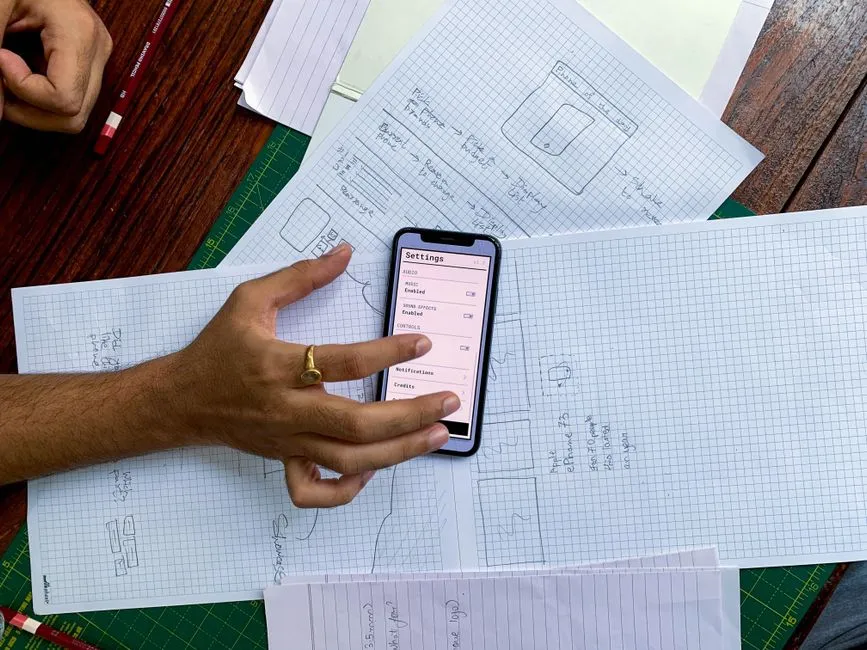
Mobile-First CSS in One Sentence
Mobile-first CSS means you write your base styles for the smallest screen first, then use min-width media queries to progressively add complexity as the viewport grows. Instead of designing for a desktop and stripping things away for phones, you start with a single, simple column that works everywhere and layer on multi-column layouts, larger type, and richer spacing only when there's room for them.
It's a mindset as much as a technique. The base stylesheet — everything outside a media query — is your phone layout. Every @media (min-width: ...) block is an enhancement, not a fix.
/* Base: mobile. No media query needed. */
.card-grid {
  display: grid;
  gap: 1rem;
  grid-template-columns: 1fr;
}

/* Enhancement: tablets and up get two columns */
@media (min-width: 48em) {
  .card-grid {
    grid-template-columns: 1fr 1fr;
  }
}

/* Enhancement: wide screens get three */
@media (min-width: 64em) {
  .card-grid {
    grid-template-columns: repeat(3, 1fr);
  }
}
Read top to bottom, that's the whole philosophy: sensible defaults, then additions.
Why Mobile-First Beats Desktop-First
The two approaches produce the same visual result if you're careful. But mobile-first wins on the things that actually matter in production: performance, maintainability, and the direction the cascade flows.
Mobile devices are the majority of traffic
For most public-facing sites, more than half of all visits come from phones. Starting with the phone layout means your default, no-media-query stylesheet is the one most of your users receive. That's the code path you want to be leanest and most reliable.
The cascade flows the right way
This is the technical heart of it. In mobile-first, you use min-width queries that add styles as screens get bigger. Each breakpoint only ever adds to what came before, so overrides are rare and the cascade reads like a story: small, then bigger, then biggest.
Desktop-first inverts this. You write full desktop styles as your base, then use max-width queries to claw things back for smaller screens. You end up writing rules whose only job is to undo earlier rules — resetting a three-column grid back to one column, shrinking padding you already set, hiding a sidebar you already built. More overrides mean more specificity battles and more places for a bug to hide.
Progressive enhancement, not graceful degradation
A phone loading a mobile-first stylesheet can stop reading at the first media query and still get a complete, usable layout. Everything above the first @media block is a finished experience. That aligns with how CSS is meant to work: a solid baseline that richer environments enhance.
| Mobile-first | Desktop-first | |
|---|---|---|
| Base styles target | Smallest screen | Largest screen |
| Media query type | min-width |
max-width |
| Breakpoints mostly... | Add features | Remove/undo features |
| Override frequency | Low | High |
| Default (no-query) layout | Phone | Desktop |
| Reads like | Small → large | Large → small |
Neither approach is "wrong," and you'll meet real codebases built both ways. But mobile-first is the modern default because it produces less code that fights itself.
How to Write Mobile-First Media Queries
The mechanics are simple once you internalize one rule: your base styles live outside any media query, and you only reach for min-width.
Start with the base
Write everything the phone needs with no media query at all. Single column, full-width elements, comfortable tap targets, readable type.
.nav {
  display: flex;
  flex-direction: column;
  gap: 0.5rem;
}

.hero {
  padding: 2rem 1rem;
  font-size: 1.5rem;
}
Add breakpoints upward
Then enhance. Notice every query below is min-width, and each one only changes what needs to change.
@media (min-width: 48em) {
  .nav {
    flex-direction: row;      /* horizontal nav once there's width */
  }
  .hero {
    padding: 4rem 2rem;
    font-size: 2.5rem;
  }
}
If you want to understand the query syntax itself in depth — and, ranges, prefers-* features — see our guide to CSS media queries. This article stays focused on the mobile-first strategy that sits on top of it.
Order matters
Because equal-specificity rules resolve by source order, write your min-width blocks from smallest to largest. A 64em block placed above a 48em block would let the smaller query override the larger one on wide screens — the opposite of what you want.
Choosing Breakpoints (Without Guessing Device Widths)
The most common mobile-first mistake is picking breakpoints to match specific phones or laptops. Don't. Device dimensions change every year, and you'll never keep up.
Set breakpoints where your content breaks, not where a device sits. Widen your browser slowly. The moment a line of text gets uncomfortably long, or a card grid starts looking too sparse, that's a breakpoint. It's content-driven, and it ages well.
That said, having a sane starting set helps. These are common, framework-agnostic values:
| Label | Width (em) | Width (px @16) | Typical target |
|---|---|---|---|
| (base) | — | — | Phones, portrait |
| sm | 36em | 576px | Large phones |
| md | 48em | 768px | Tablets |
| lg | 64em | 1024px | Small laptops |
| xl | 80em | 1280px | Desktops |
Why em for breakpoints
Using em in the media query itself means breakpoints respond to the user's browser font-size setting. A reader who bumps their default font up gets your layout switching a little earlier, which keeps text from crowding. 1em in a media query always equals the browser's root font size (usually 16px), regardless of any font-size you've set on elements — so 48em reliably means 768px at default settings. It's a small accessibility win with no real downside.
For the difference between em, rem, px, and the rest — and when each is the right call — our CSS units guide breaks it down with examples.
Mobile-First in Sass
Sass makes mobile-first noticeably cleaner because you can name your breakpoints once and stop memorizing pixel values. A small mixin plus a map of tokens is the common pattern.
// _breakpoints.scss
$breakpoints: (
  "sm": 36em,
  "md": 48em,
  "lg": 64em,
  "xl": 80em,
);

@use "sass:map";

@mixin from($name) {
  $width: map.get($breakpoints, $name);

  @if $width {
    @media (min-width: $width) {
      @content;
    }
  } @else {
    @error "Unknown breakpoint: #{$name}.";
  }
}
Now your components read almost like plain English, and the mobile-first order is baked in — base styles first, @include from(...) enhancements after:
.card-grid {
  display: grid;
  gap: 1rem;
  grid-template-columns: 1fr;

  @include from("md") {
    grid-template-columns: 1fr 1fr;
  }

  @include from("lg") {
    grid-template-columns: repeat(3, 1fr);
  }
}
The @media rules bubble up to the top level when compiled, so nesting them inside the selector like this is just for readability — the output is identical to hand-written queries. This uses the modern @use and sass:map module syntax that ships with Dart Sass; the older @import and global map-get() still work but are on the way out.
Layout Techniques That Are Mobile-First by Default
Here's the part many tutorials bury: modern CSS layout often adapts without media queries at all. Lean on these and you'll write fewer breakpoints.
- Flexbox with
flex-wrap: wraplets items sit in a row when there's space and stack when there isn't — no query required. grid-template-columns: repeat(auto-fit, minmax(16rem, 1fr))creates a grid that fits as many columns as will hold a 16rem minimum, then reflows down to one on narrow screens. This single line replaces three or four breakpoints of grid changes.- Fluid type with
clamp()scales font size smoothly between a floor and a ceiling:font-size: clamp(1.5rem, 4vw, 2.5rem);. The text grows with the viewport instead of jumping at each breakpoint.
/* An intrinsically responsive grid — zero media queries */
.auto-grid {
  display: grid;
  gap: 1.5rem;
  grid-template-columns: repeat(auto-fit, minmax(16rem, 1fr));
}
Media queries are still essential for structural changes — turning a stacked nav into a horizontal bar, showing or hiding a sidebar — but treat them as the tool of last resort, after fluid units and intrinsic layout have done what they can.
Common Mobile-First Mistakes
Even with the right structure, a few habits quietly undo the benefits.
- Setting a fixed base width. If your base
.containeriswidth: 960px, you're not mobile-first — you've hidden a desktop layout in the default styles and forced phones to scroll sideways. Base widths should be fluid (width: 100%,max-widthfor the ceiling). - Forgetting the viewport meta tag. No amount of mobile-first CSS matters if the page ships without
<meta name="viewport" content="width=device-width, initial-scale=1">. Without it, mobile browsers pretend to be ~980px wide and zoom out. - Mixing
min-widthandmax-widthcarelessly. Combining both in one project is fine, but stacking overlapping ranges on the same property is how you get styles that apply in a band you didn't intend. Pickmin-widthas your default and stay consistent. - Testing only in a desktop devtools emulator. Emulators are great for iteration, but real phones expose touch-target size, font rendering, and scroll behavior that a resized browser window won't. Check on an actual device before shipping.
- Ignoring tap-target size. Buttons and links need roughly 44×44px of hittable area on touch screens. That's a mobile-first concern your base styles should handle from the start.
For where mobile-first fits into the bigger picture — images, performance, testing across a full range of devices — see our responsive web design guide, which uses this approach as its foundation.
The Bottom Line
Mobile-first CSS isn't a framework or a plugin — it's an ordering discipline. Write the phone layout as your base with no media query, use min-width to enhance upward, choose breakpoints where your content demands them, and lean on clamp(), auto-fit, and flex-wrap so you write fewer queries in the first place. Do that and your stylesheet stays small, your cascade stays sane, and the majority of your users — the ones on phones — get your fastest, most reliable code path by default.